Groupon B2B Emails
CLIENT: GROUPON
THE BRIEF
ART DIRECTORS:
Jamie Blass + Lori Kaplan
DESIGNER:
Brittany Campbell
The Groupon Merchant facing emails were using old and outdated styles. The merchant marketing team requested a clean and simple design that could be used across many different emails. The email redesign should have a style guide that designers, marketing, and engineers could all use to shape future emails.
STYLEGUIDE
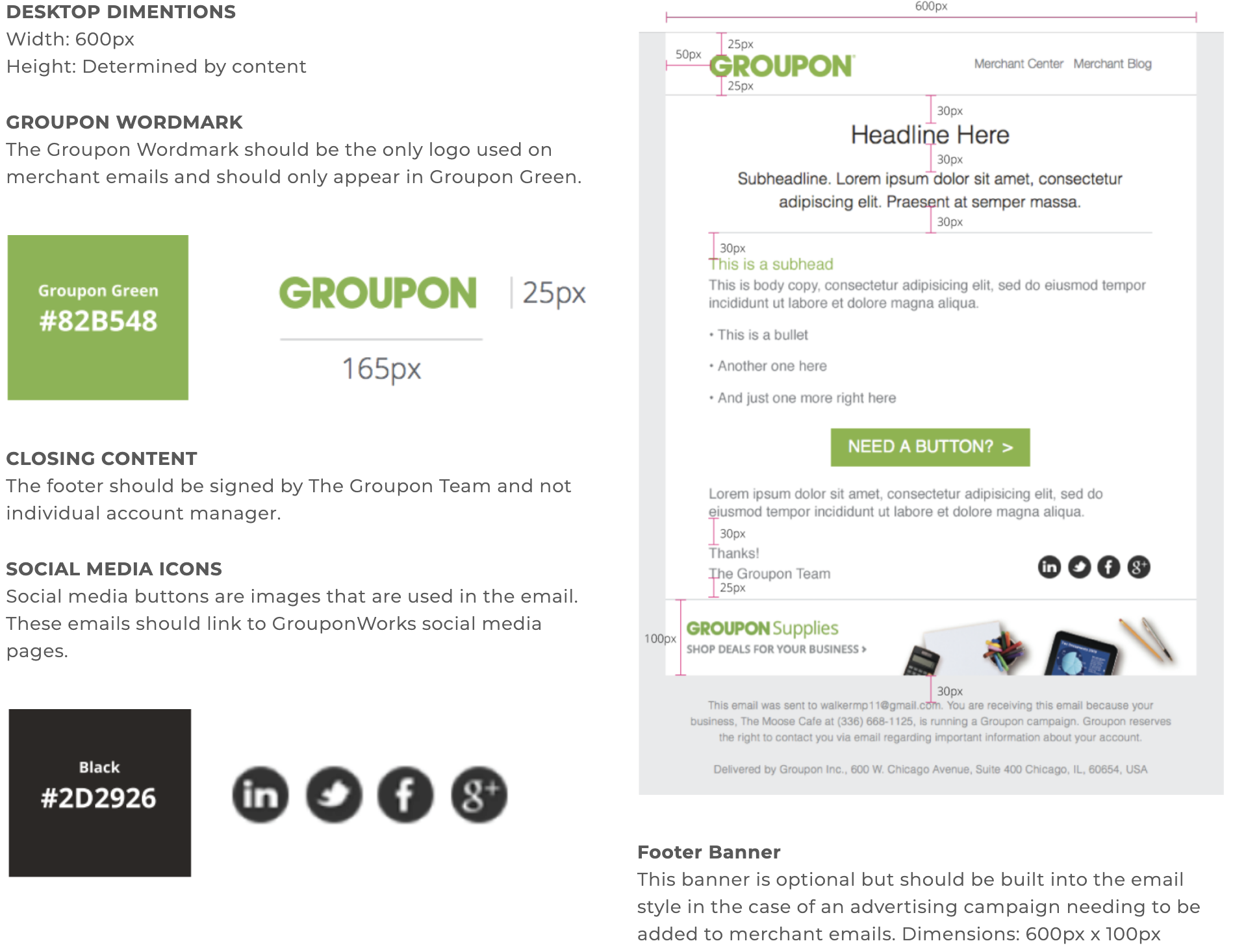
I created a digital pdf style guide complete with CSS code to help our developers create a series of templates.
TYPOGRAPHY
In our style guide, I included CSS code for all the different type styles we would need across each template.
MOBILE
Our old email templates did not have a mobile experience so part of this redesign was to account for mobile.
EXAMPLES
Our templates accounted for many different types of b2b emails, including:
• Campaign Launches
• Event Invites
• Customer Surveys
BEFORE
The previous designs used a lot of green and the out dated logo. The emails had a lot of copy and lacked hierarchy. If there were any visuals present, they weren't consistent or engaging.
SKETCHES
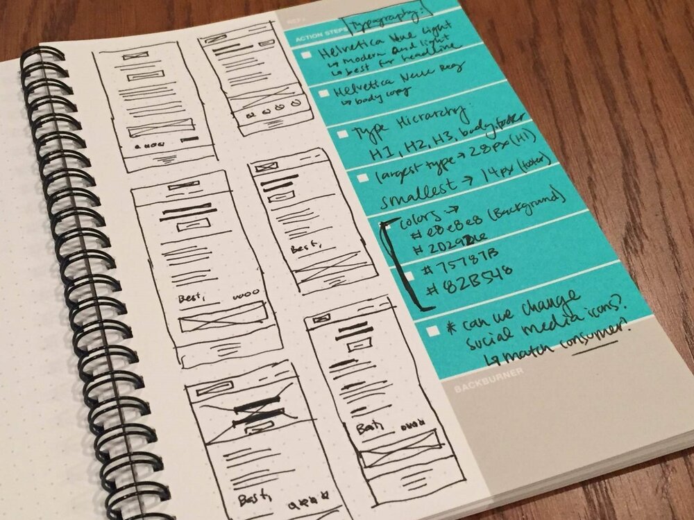
In addition to creating more hierarchy with different type sizes and weights, I started thinking about how to incorporate imagery and widgetize the email templates. There would be an area for headline banners and images as well as a bottom banner that could be use to advertise new programs and features. I also tried to place social media icons in the email body instead of the footer due to Groupon's new initiative to provide tips and resources to small business owners via Facebook, Twitter, and our Merchant Blog.


